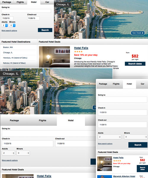
Starting in 2014 Neat began being updated to a more mobile friendly platform. In early 2014, the main hotel booking path was given a separate mobile website. Later in 2014, a mobile booking path was created for vacation packages. These mobile updates did not encompass merchandising pages though, so throughout 2015 I have been working to create responsive merchandising pages.
Early to mid 2015 I worked with our development team to create a responsive version of our automated merchandising pages. These merchandising pages are used by our smaller partners. They are a template merchandising page that allows small partners that don’t qualify for a full custom merchandising page a way to generate merchandising pages to help promote specific destinations. With the development teams help, we rolled out a fully responsive automated merchandising page in mid 2015.
Currently I have been working on updating larger partners’ merchandising pages to be responsive as well.